
What 'print-ready' actually means
A printer is not a designer. Their job is to reproduce your file faithfully, not to interpret it — which means that if something is wrong in the artwork, they will either send it back or, worse, print it wrong and send you an invoice. Understanding what they need, before you export, saves you at least one round-trip and often a week.

Start with geometry. Every printed piece has three concentric rectangles and they are not the same size. The bleed is the outermost — artwork extended a few millimetres beyond where the cut will fall, so that if the guillotine drifts slightly, you still get colour to the edge rather than a sliver of white. The trim line is where the cut is intended to land. Inside that, the safety margin is the zone in which nothing important — no name, no date, no decorative border — should sit, because anything that close to the cut edge is genuinely at risk of being trimmed off. Confuse these three, or omit the bleed layer entirely, and the job comes back before it gets to press. Extend a background colour or texture to the bleed edge; keep all live content inside the safety boundary. That is the geometry, in full.
Type is the next source of failure. Your design uses a font the printer's system may not have. When software encounters a font it cannot find, it substitutes the nearest match — which might be close enough to look merely odd, or different enough to reflow the entire layout. The fix is to outline the type before export: the letterforms become vector shapes rather than typographic instructions, and the printer's system has nothing to substitute. Do this as a final step on a duplicate of your working file, because outlined type can no longer be edited as text. Check that no character has been missed — a common problem when text sits inside a linked or embedded object.
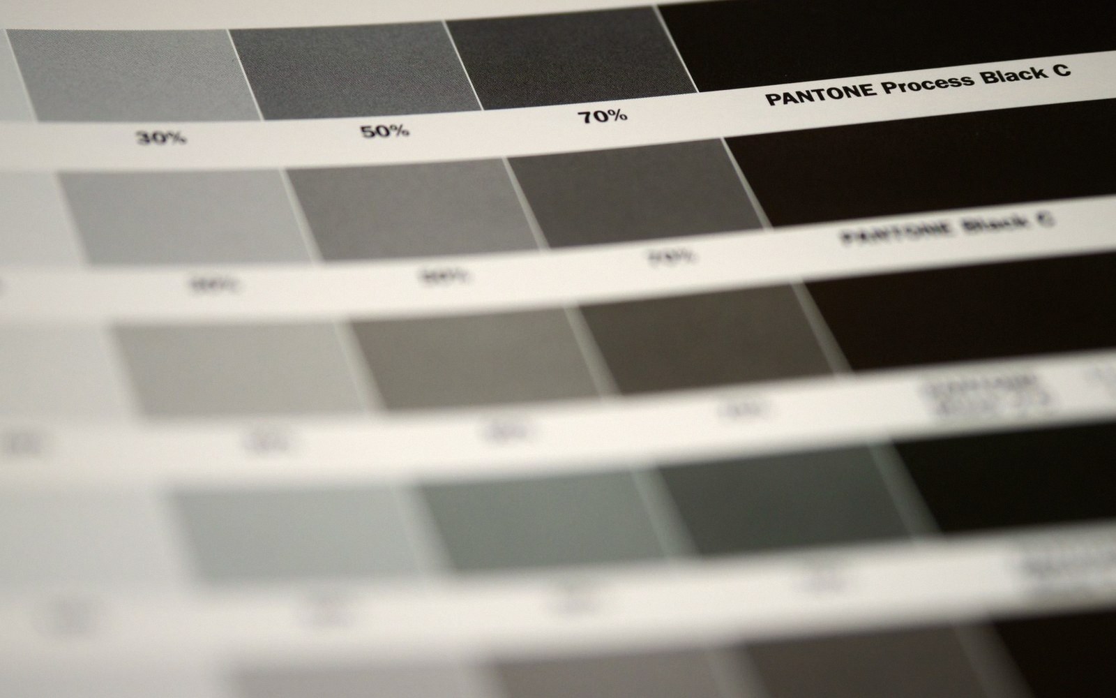
Colour is where a surprising amount of money is lost. Printing presses run on CMYK — cyan, magenta, yellow and black — not on the RGB that screens use. A file supplied in RGB will be converted by the printer's software, and that conversion is not the same as a deliberate, human-checked CMYK conversion done in design software. Convert to CMYK yourself, in the correct colour profile for the press (ask which one; it varies). Then: if you have specified a particular ink — a Pantone colour, for instance, to match an envelope lining or a ribbon — make sure you have named it identically everywhere it appears. The same colour specified as two slightly different names becomes two separate ink channels, which can mean two plates and two charges. Name it once, use that name consistently, and check it in the swatches panel before export.
Resolution sits underneath all of this. Screen images look sharp at 72 dpi; print requires 300 dpi at the final output size. An image that appears crisp in your design file may have been placed at a reduced display size, masking the fact that at print dimensions it is under-resolution. Export a proof at full size and zoom in to check raster elements before sending anything to press.
Finally: export as PDF/X — specifically PDF/X-1a or PDF/X-4 depending on what the printer specifies — with crop marks and bleed included in the export settings. This format embeds everything: fonts (as outlines), colour profiles, linked images. A native InDesign or Illustrator file is not a print-ready file, because it relies on assets and fonts that exist only on your machine.
Send these five things right — geometry, type, colour naming, resolution, export format — and there is very little for a printer to query.